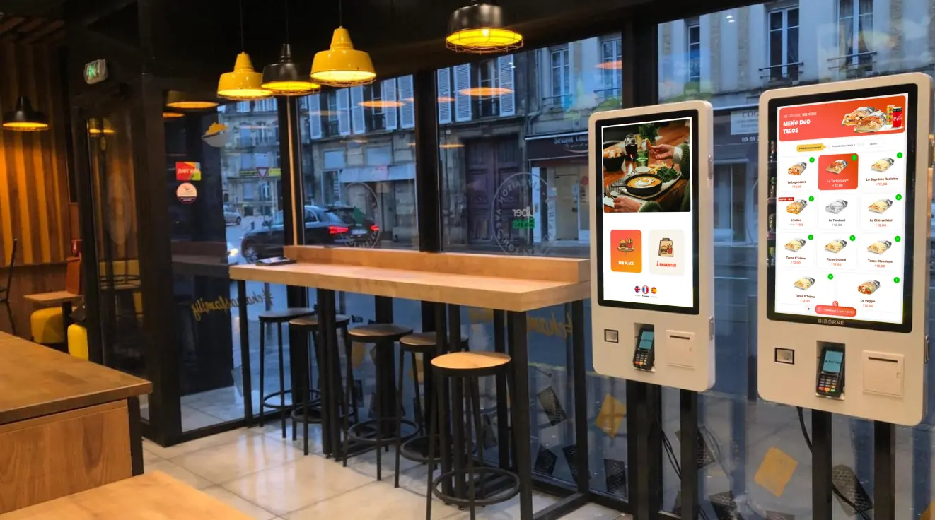
Biborne Restaurant Operations Ecosystem
Biborne builds intuitive FoodTech solutions that simplify ordering, speed up service, and elevate the restaurant experience.
Scope
Multi-platform system (Kiosk, Mobile, Web, Kitchen Displays, POS)
Product Design
Aug 2023 - Present
Project Overview
Client
Biborne
Industry
FoodTech
Biborne is a large-scale restaurant ecosystem dedicated to tackling the chaos of operations. It’s a platform designed to streamline everything from ordering and delivery logistics to crucial kitchen workflows.
The goal:
My role involved leading the UX to optimize this entire system, especially our smart kiosks, driven by the ambition to significantly boost peak-hour performance and improve efficiency for both restaurant staff and customers.
How it works
The Product
Core Challenge
Ordering on the kiosk was slow and confusing, with hard-to-find categories, complex customization steps, and low visibility of add-ons. Accessibility issues added friction for customers. On the operational side, restaurants faced peak-hour bottlenecks, abandoned orders, and inconsistent kitchen data... all increasing staff workload and reducing throughput.
Customer Pain Points
- Hard-to-find categories and meals
- Confusing customization flow causing drop-offs
- Poor visibility of toppings/add-ons
- Small touch targets and inconsistent layouts
- Low confidence before checkout → restarts
Restaurant & Staff Pain Points
- Peak-hour congestion at kiosks
- High number of abandoned orders
- Incorrect or inconsistent kitchen orders
- Staff frequently pulled to assist confused customers
- Misaligned kiosk → POS patterns causing inefficiency
Before
Process/Methodology
I approached the kiosk redesign by grounding every decision in usability, speed, and operational impact:
1. User-Centered Observation: Studied real customers using the kiosk during peak hours to understand navigation issues, customization confusion, and decision bottlenecks.

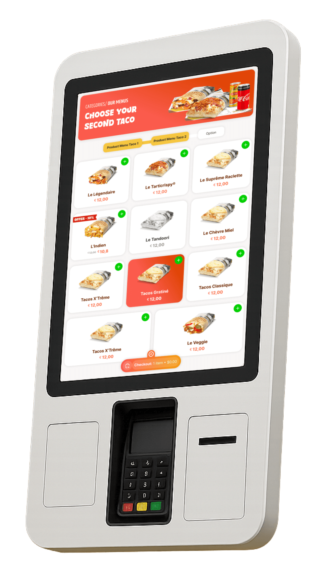
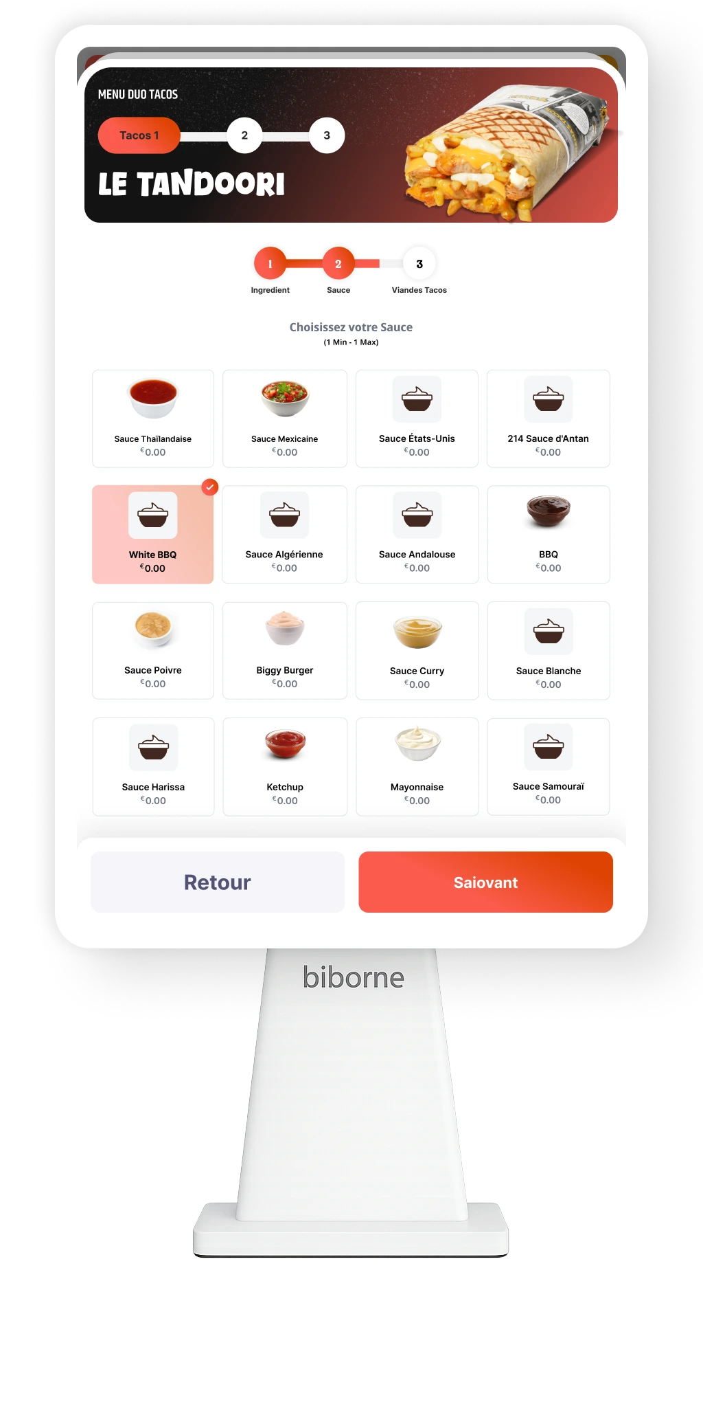
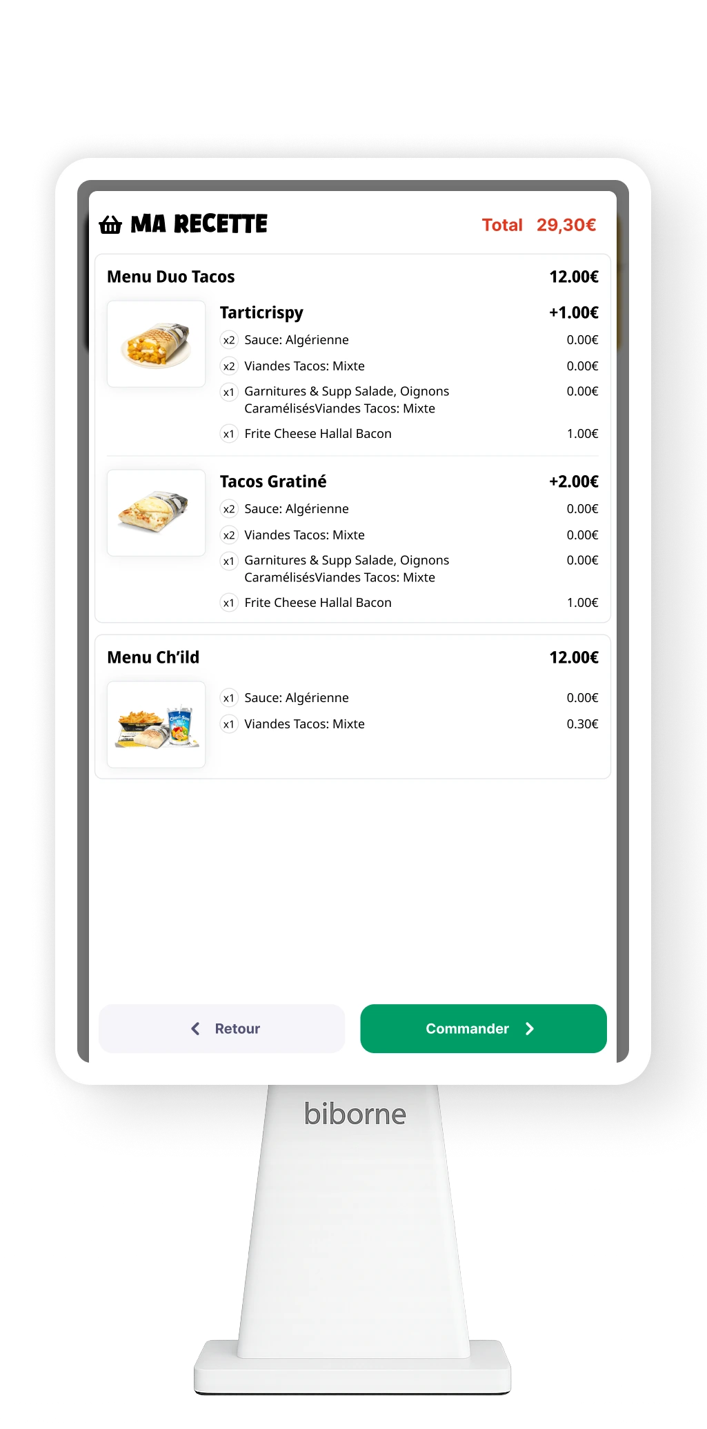
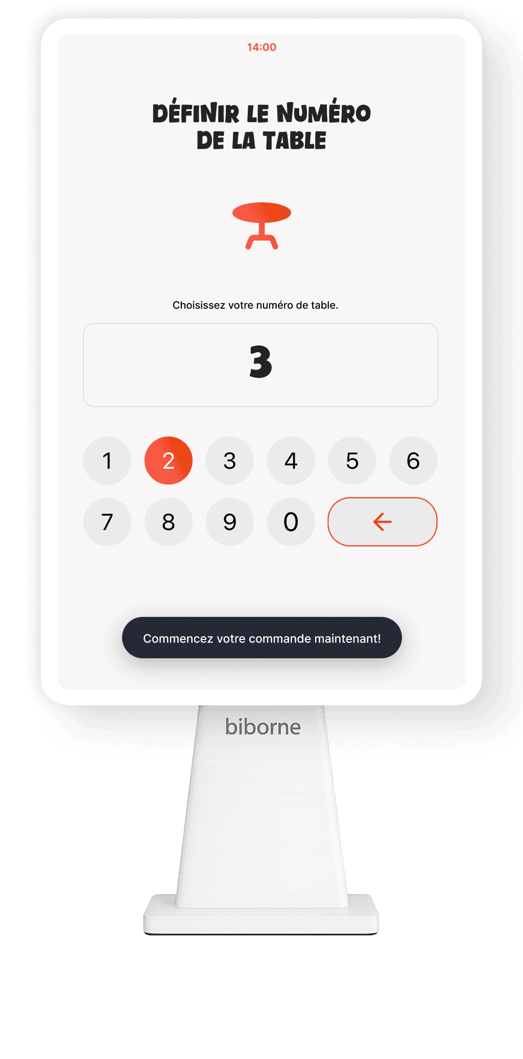
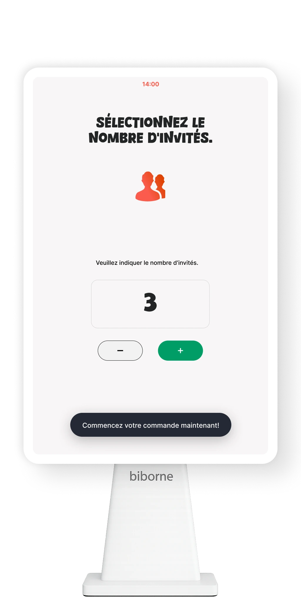
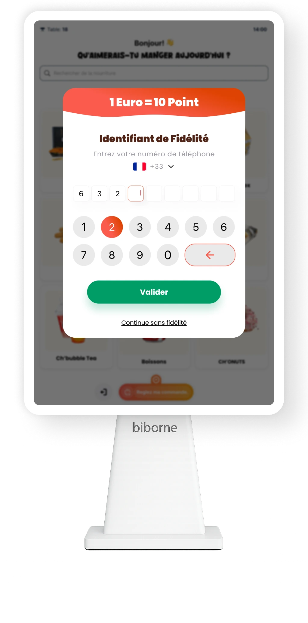
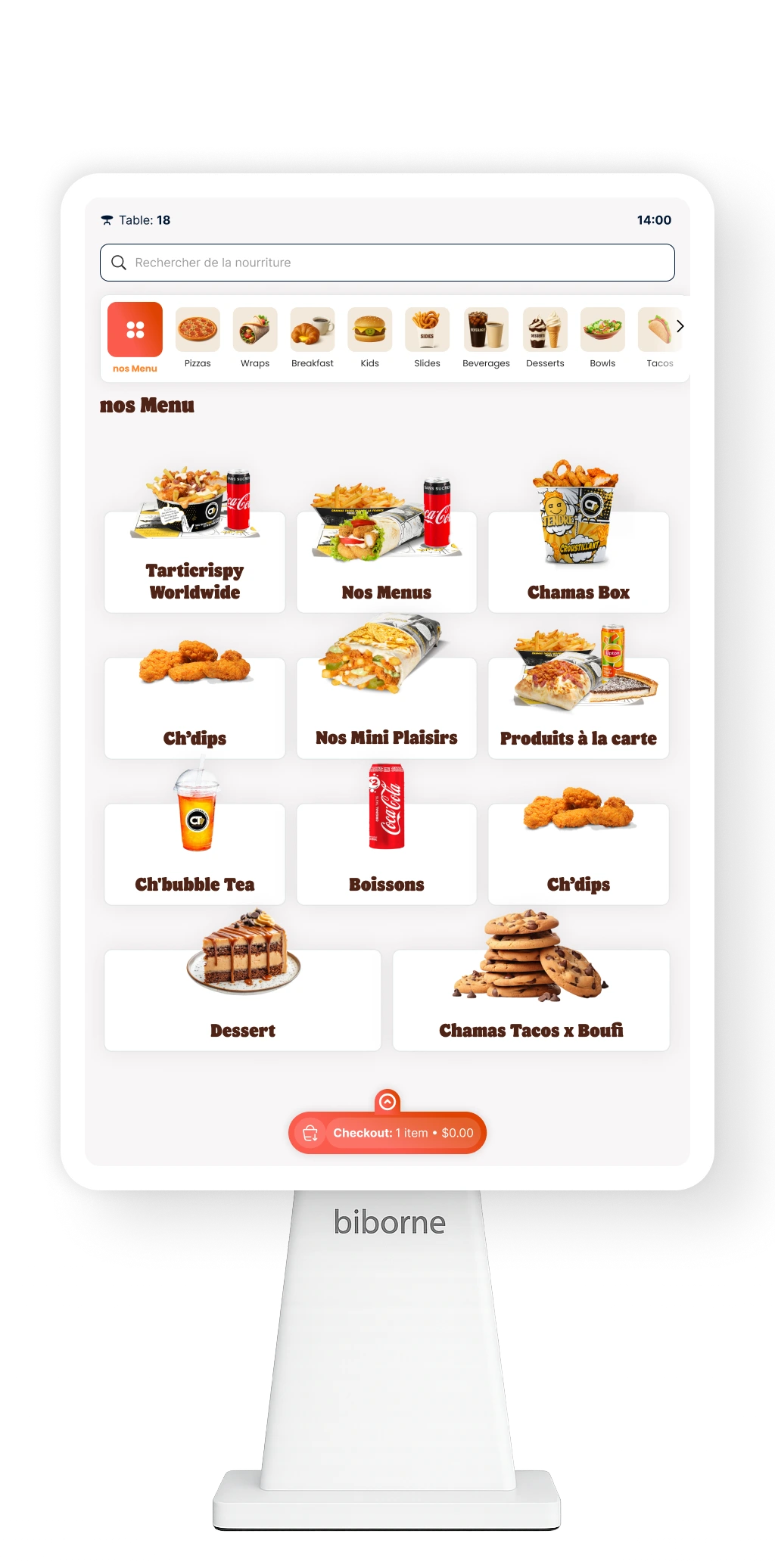
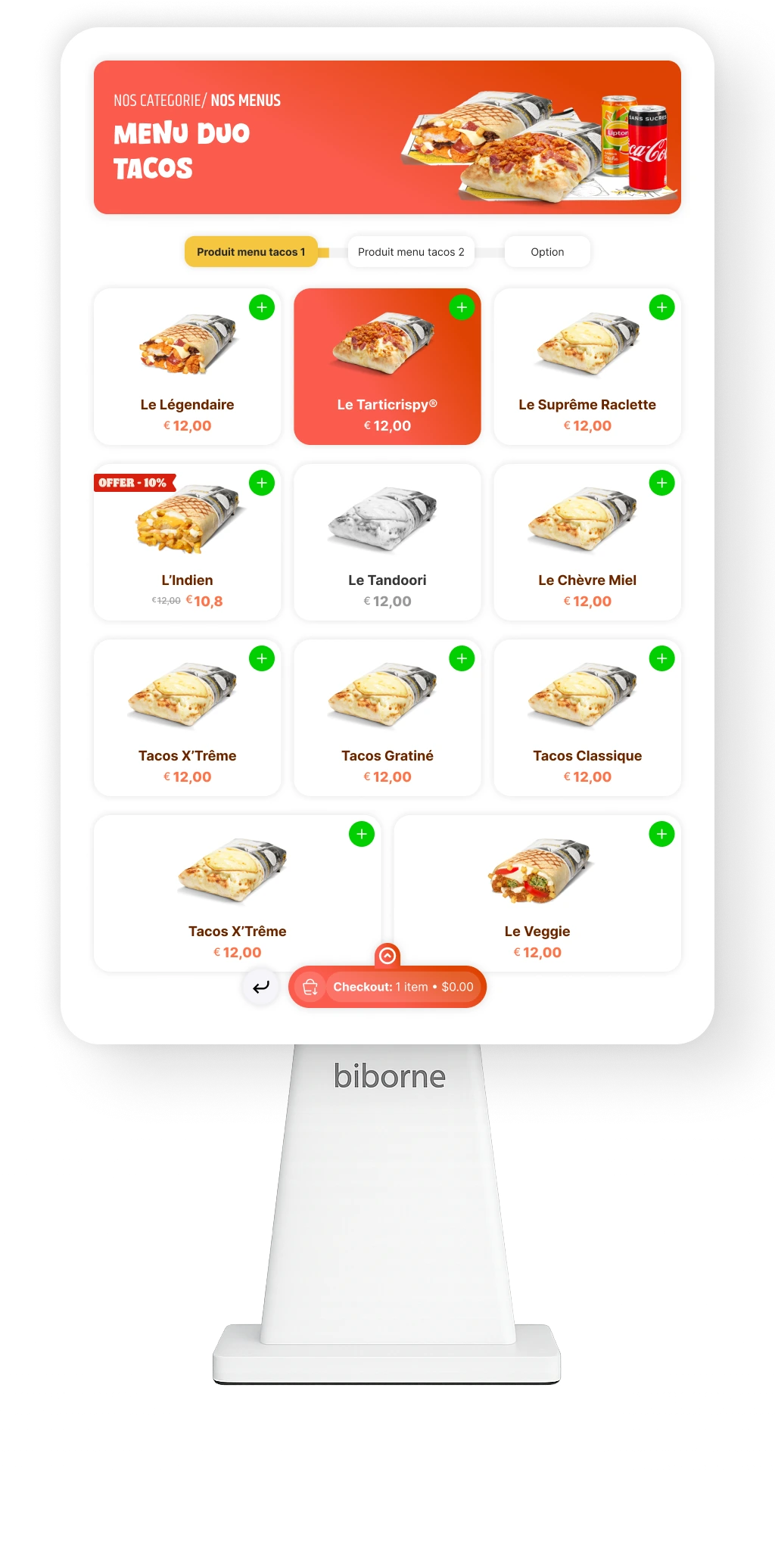
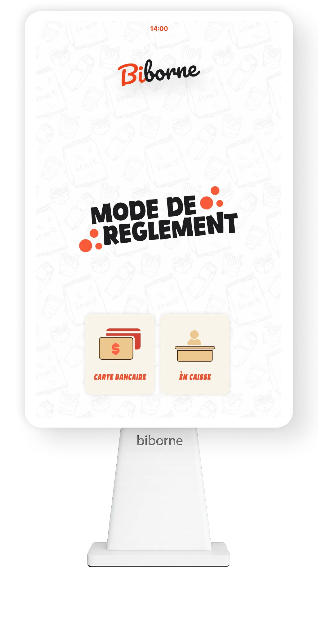
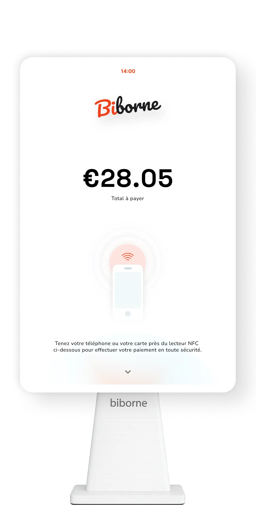
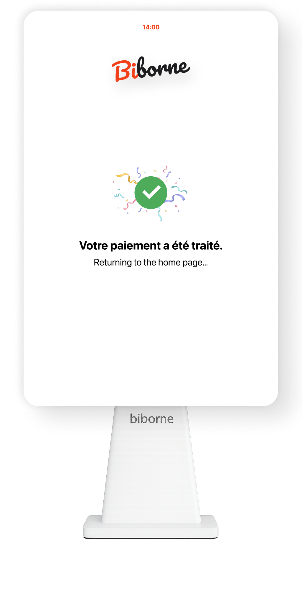
2. Flow Redesign:
Simplified category structure, streamlined customization, and introduced a faster checkout path optimized for rush-hour efficiency.

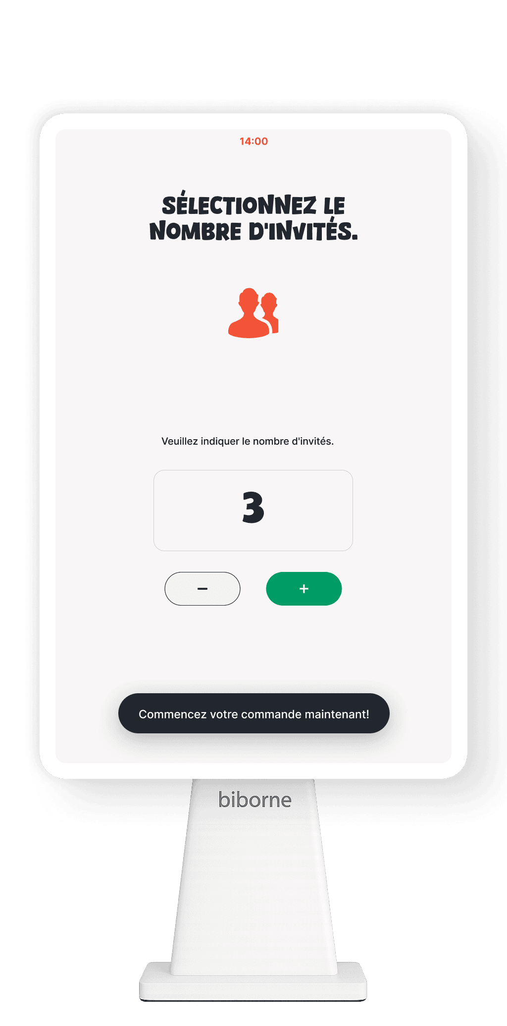
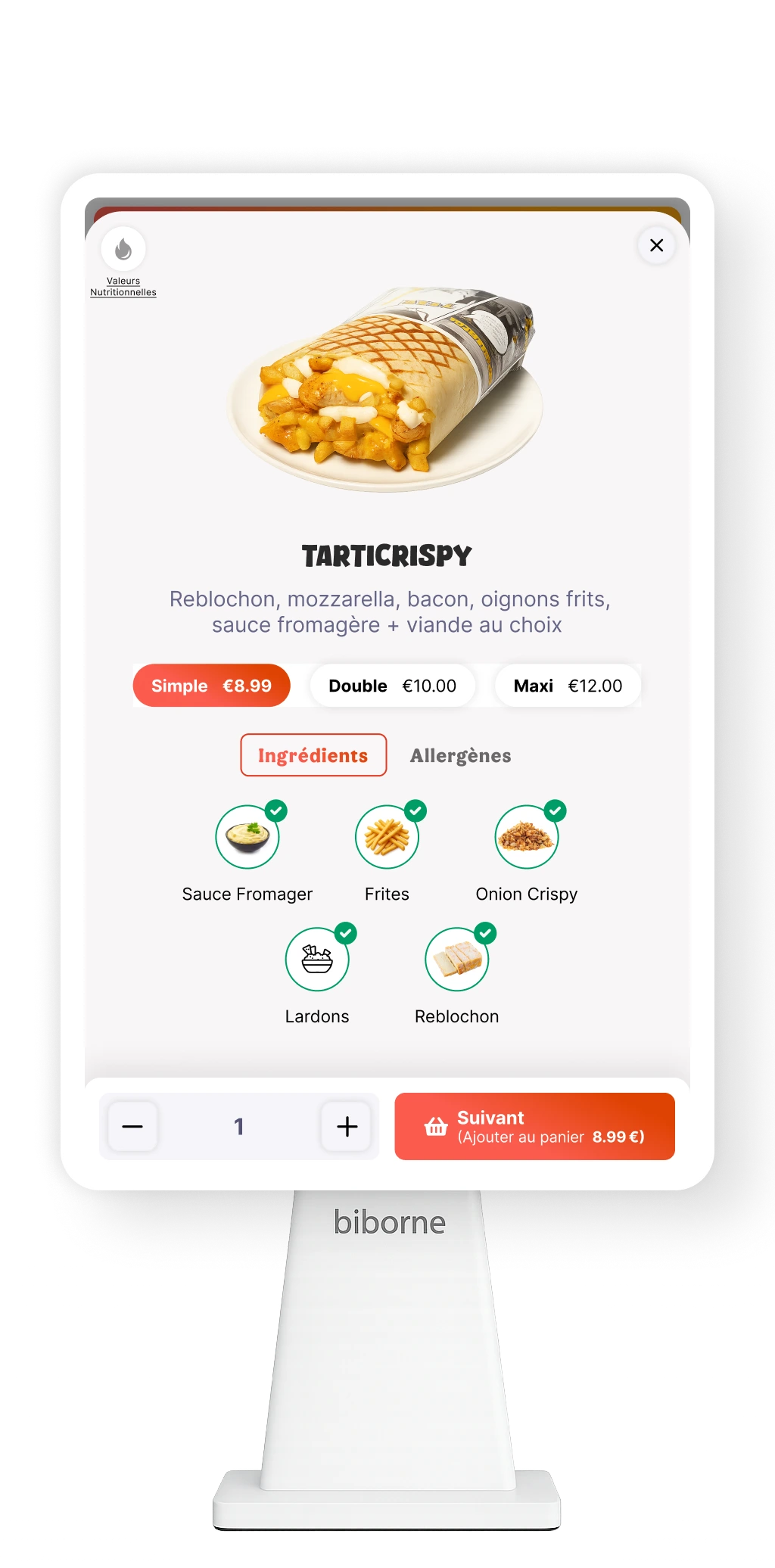
3. Touch-Friendly UI/UX: Designed a clean, visual, tap-friendly interface with clear hierarchy, large touch targets, and high visibility for add-ons.

4. Upsell & Efficiency Optimization: Improved add-on discovery, reduced cognitive load, and created a more predictable step-by-step flow.

5. Iterative Testing: Validated prototypes with customers and staff, refining layout, speed, and clarity before piloting in live restaurant environments.
The Results
After
+32%
Faster average ordering time
22%
Reduction in abandoned orders
72%
Increase in add-on and upgrade selections
Real shot in a client franchise restaurent
Results/Outcomes
The project delivered measurable improvements, including:
• Faster Ordering Flow: Average order time decreased by 32%, driven by clearer navigation, simplified customization, and improved accessibility.
Higher Order Value: Add-on and upgrade selections increased by 15% after surfacing toppings and extras at the right moments
Improved Operational Efficiency: Restaurants processed 27% more orders per hour, significantly easing peak-time congestion.
Lower Staff Burden: Staff intervention at kiosks dropped by 40%, allowing teams to stay focused on service and kitchen operations.
More Accurate Kitchen Order: Unified UX patterns with the POS reduced order errors by 18%, leading to smoother kitchen throughput.
Positive Customer Feedback: Users consistently described the new kiosk as faster, clearer, and easier to navigate, boosting overall satisfaction.
Company Logo
Demo Prototype
Social Media
Social Media
Social Media
Social Media